Problem Statement:
The user needs a "search" experience that is consistent throughout all avenues and search types, with consistent filtration, clear direction, and understandable calls to action because that will give them the ability to quickly and easily find and get care for themselves and their family. The client's current state is confusing users and preventing them from getting the care they need quickly.
Overview:
As a product design intern, I was expected to utilize skills in human centered design, market research, and design thinking to work quickly and provide our healthcare client with high quality digital designs to improve the user experience on the search and provider profile portions of their website.
My client team quickly entrusted me with full-time levels of responsibility, even giving me the ability to run my own work-stream and report back to the team on my progress weekly in our team standup meetings. Given the nature of consulting, this work has been heavily redacted and altered from its original state to be made presentable.
Competitive Analysis:
Before I jumped into the project, to truly understand why the search functionality of the client site was performing poorly, I went to competitors and compared them alongside our experience to see where the user experience may rise and fall in quality and how the competitors may be beating us out. This allowed us to pick and choose ideas and concepts that the competition is using to streamline processes and optimize user experience.
The below examples are lower resolution to protect certain comments and notes proprietary to the client.
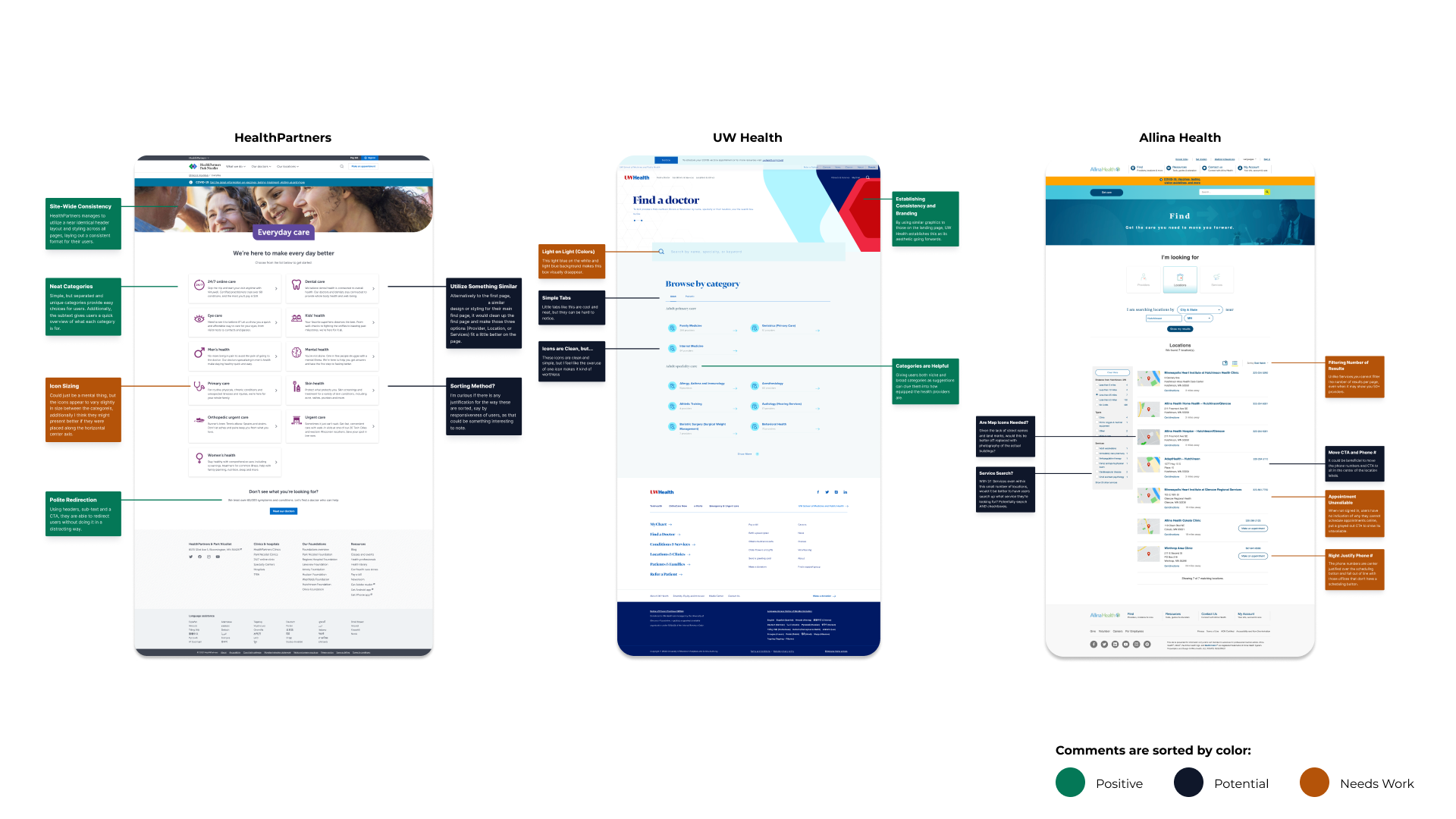
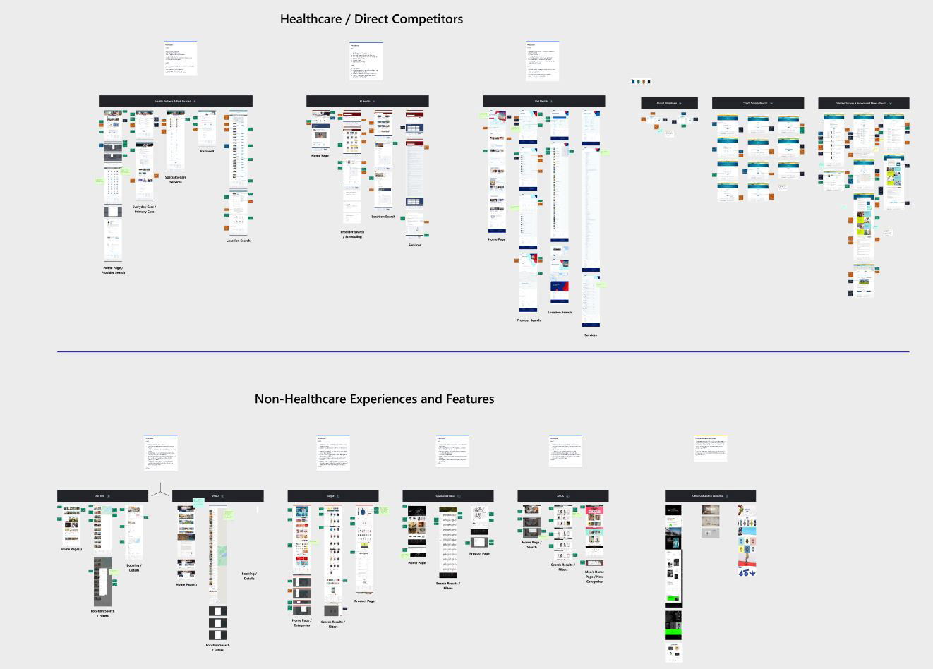
In the end we found that search functionality for our client would be strongest if it kept to its roots, but cleaned up, modernized, and updated for modern web design standards. By looking across both Healthcare and Non-Healthcare experiences, I was able to find features and qualities of strong user experiences to inspire early stage sketching and wireframing.
Idea Generation:
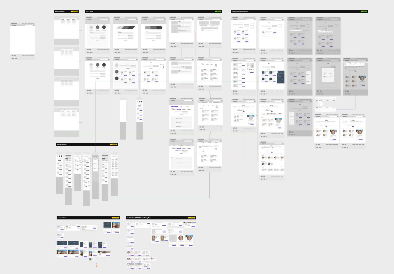
This project required highly detail oriented problem solving, often achieved through several rounds of ideation "sketches" and wireframes that would be reviewed during 1-on-1's and weekly team standup meetings. Early stage designs were quick developments off of one another and often spiraled into various paths, leading to the winding arrows and connecting lines seen above.
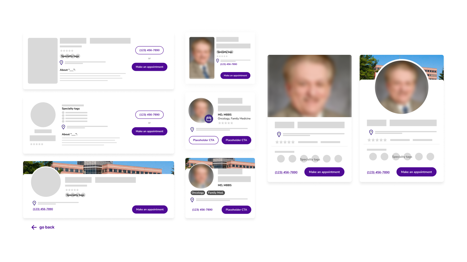
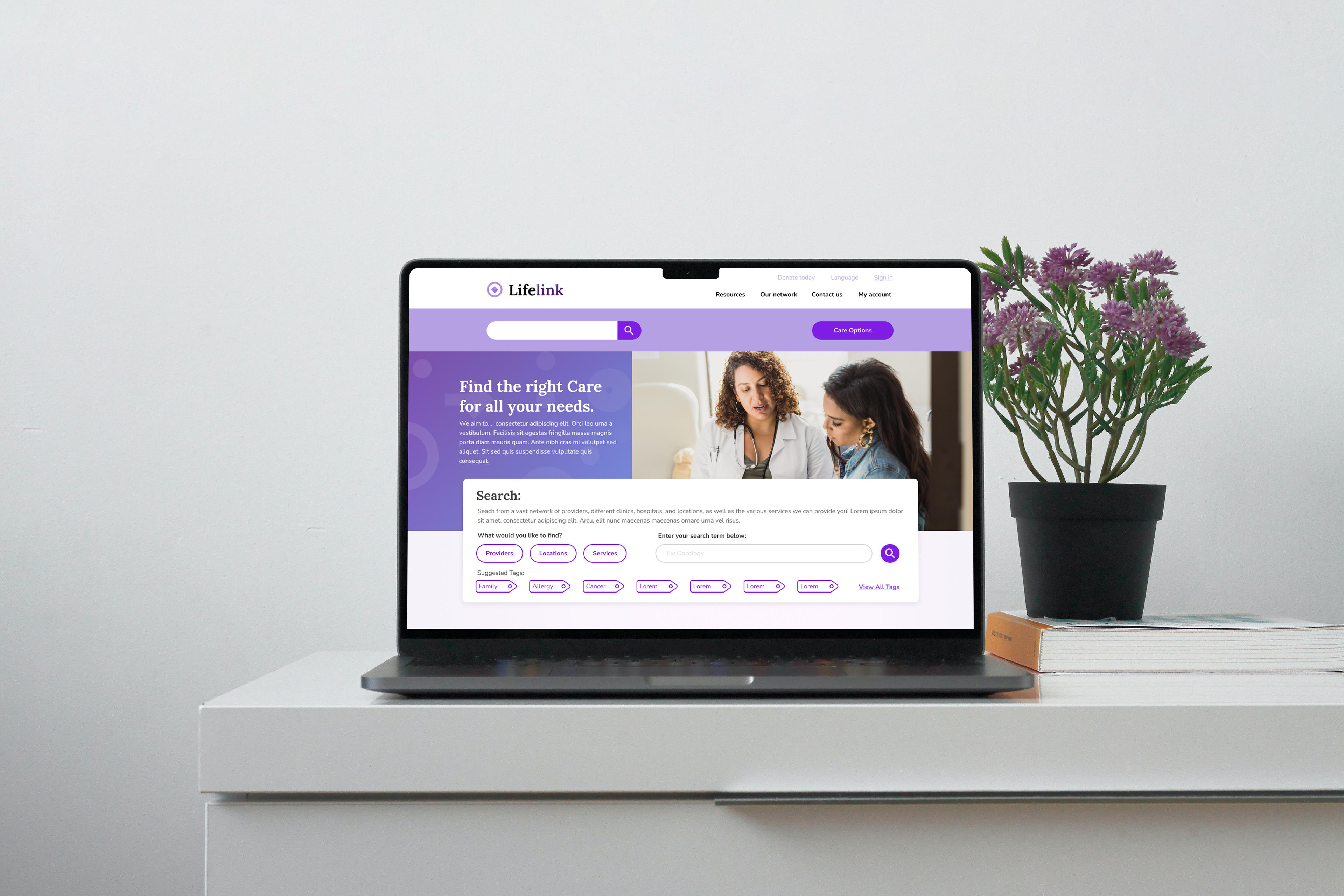
High Fidelity Designs:
After working through idea generation, it was time to take the strongest Ideas and assemble them into high fidelity designs to be pitched to our end-client and worked on by the rest of my team following the end of my internship. The team had decided on three possible design paths I could take and was told to work on all three. I've included one design below.
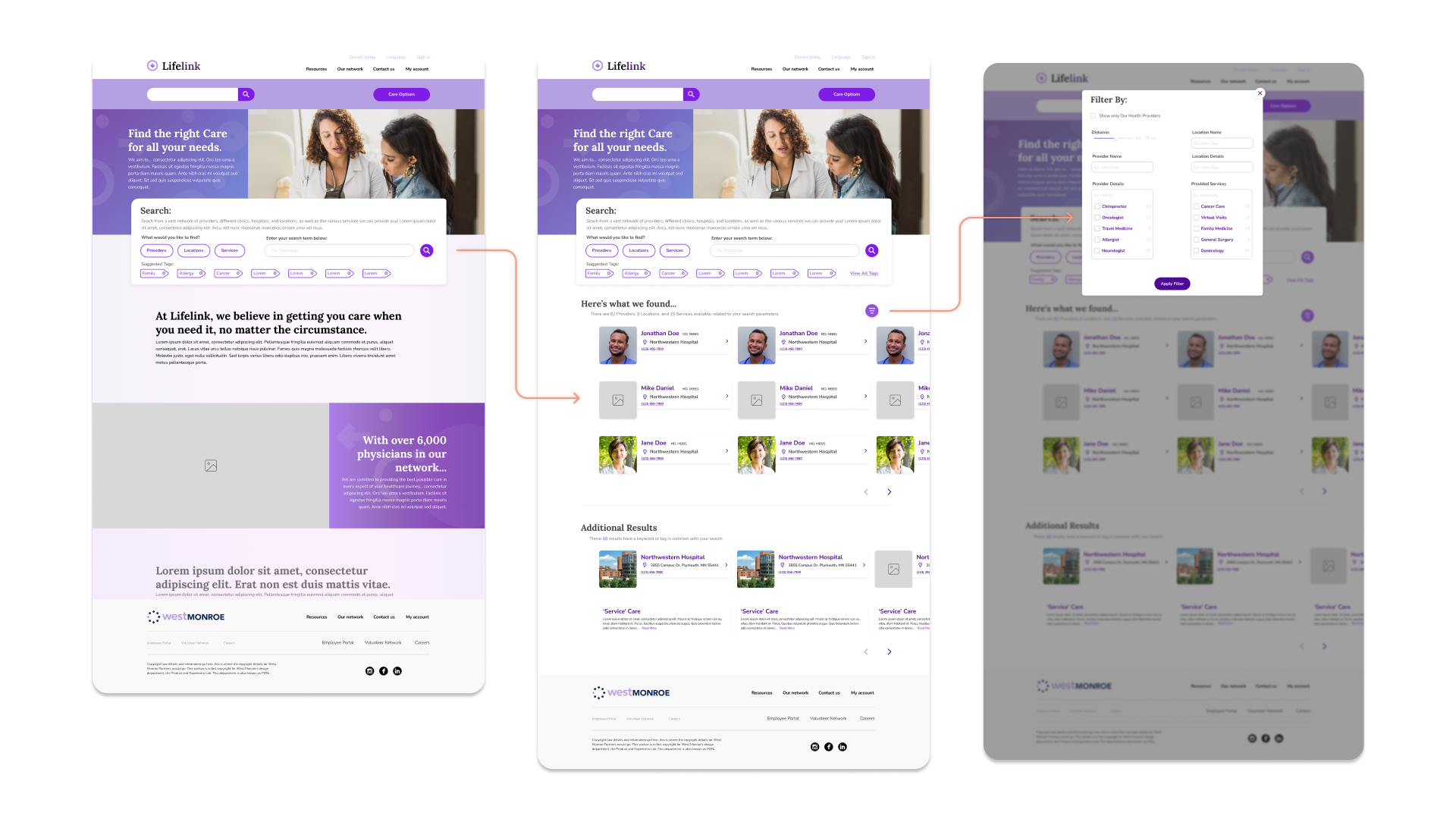
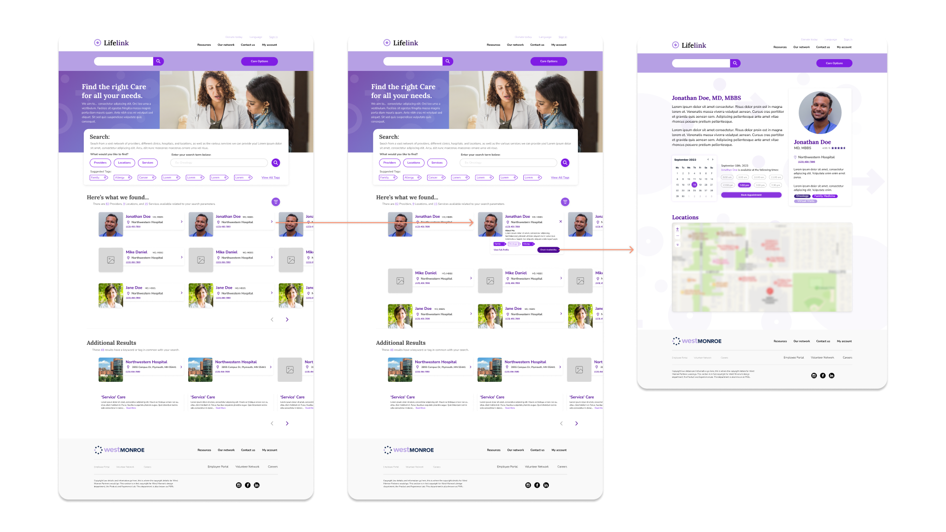
This design was designed to allow users to always edit and refine their search while browsing results for the existing search. The presence of filters allowed the user to pair down their search further without starting over if desired. Additionally, presenting the user with suggestions for other search opportunities provided the user the ability to find something that may solve their problem faster, but it's current design prioritizes not making this the main emphasis on the page.
This experience helped me grow immensely as a designer, working alongside constant critique from an extremely solid team and having a wonderful network only further inspired me to continue working as a designer.